How to Choose Wedding Colors That Actually Feel Like You (Using AI the Right Way)
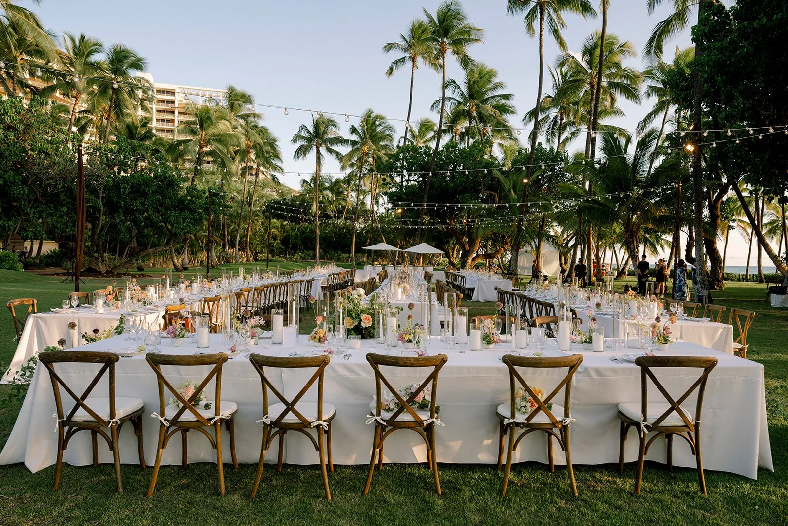
Photography by Present Perfect
There is no shortage of beautiful wedding inspiration online. Between Instagram, Pinterest, and now AI-generated images, couples have access to more design ideas than ever before.
But more inspiration does not always make wedding design easier.
We are starting to see couples bring in AI-generated wedding images that look beautiful on a screen but are not necessarily realistic to create. The flowers may be out of season or arranged in ways that would not physically work. The scale of the installations may require far more labor and materials than couples understand. Sometimes the venue itself has even been altered into something that does not exist in real life.
This is similar to the difference between styled shoots and real weddings (Read more about our thoughts on styled shoots in our blog post: The Difference Between Styled Shoots and Real Weddings). An image can be beautiful and inspiring while still leaving out the practical details, logistical challenges, and the financial investment required to bring it to life.
That does not mean AI has no place in the wedding design process. We simply think it is more helpful as a tool for refining your ideas than generating the finished vision.
The most successful way we have seen clients utilize AI has been to identify a color palette that feels personal to both of you, supports the atmosphere you want to create, and works naturally within your Hawaii wedding venue.There are many ways to build a thoughtful wedding color palette. You can begin with color theory, your venue, a meaningful place, or even a piece of art you both love. This approach begins somewhere a little more personal, with the colors that naturally complement each of you.
It is also a helpful way to move beyond endlessly collecting inspiration and begin finding a direction that actually feels like you.
1. Begin With How You Want Your Wedding to Feel
Photography by Present Perfect
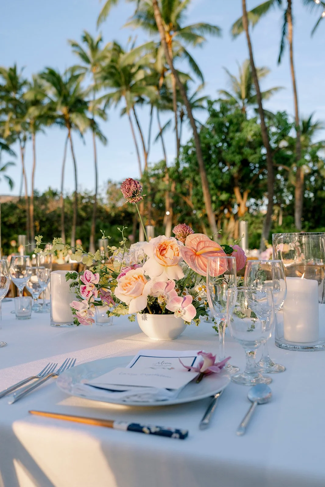
Most people assume wedding design starts with picking colors. At Love Letter Weddings, it doesn't. We start by asking how you want the day to feel.
Maybe you want your wedding to feel romantic and intimate. Maybe you're drawn to something fresh, playful, and welcoming. Maybe you want it to feel timeless and polished, or relaxed, whimsical, and full of personality.
Sit down together and choose three to five words that describe the experience you want to create. Keep those words nearby as you work through the rest of the process. They'll help you decide whether a color palette is simply beautiful or whether it actually supports the energy you want your wedding to have.
This is where those words start to matter. If you're drawn to a romantic, intimate feel, that often shows up in your color choices before you even realize it. You might find yourself pulled toward soft pinks, deep reds, or a jewel toned blue or green. If you're drawn to something fresher and more playful instead, you might gravitate toward yellows, oranges, and poppy pinks without knowing exactly why. It isn't about which palette is more beautiful, it's about which one feels like your story.
2. Use AI to Explore Your Personal Color Seasons
If you have never explored personal color analysis before, you might become a little obsessed once you figure out your color season.
Learning which colors make your skin look brighter, your eyes stand out, and your overall coloring feel more balanced can completely change the way you think about your favorite shades.
Personal color analysis looks at your skin tone, natural hair color, eye color, undertones, and overall contrast. From there, it helps identify whether you tend to look best in colors that are warm or cool, soft or bright, light or deep.
To get started, upload several clear photos taken in natural daylight. Include a few different clothing colors, minimal makeup when possible, and no strong filters or color editing.
Suggested AI Prompt
Analyze these photos using established fashion color analysis principles. Consider my skin undertone, natural hair color, eye color, overall contrast, and how the different clothing and makeup colors affect my appearance.
Identify my most likely seasonal color category and explain your reasoning. Please tell me whether I appear best in warm or cool colors, bright or muted colors, and light or deep shades.
List the colors that appear most flattering, the colors that seem less harmonious, and any uncertainty caused by lighting, makeup, or image quality. Treat this as a helpful starting point rather than a definitive professional color analysis.
Repeat the process for both people in the couple.
3. Find the Colors That Work for Both of You
Once you each have a likely color season or a list of flattering shades, ask AI to compare the two.
You are looking for areas of overlap, not an exact match.
One person may look best in warm, muted colors while the other is better suited to deeper, cooler tones. There are usually still shared shades or color families that can connect the two.
Suggested AI Prompt
One of us has been identified as a [insert color season] and looks best in [insert warm or cool, bright or muted, light or deep tones].
The other has been identified as a [insert color season] and looks best in [insert warm or cool, bright or muted, light or deep tones].
Please identify the strongest areas of overlap between our two color palettes and suggest shades that could flatter both of us. We want our wedding to feel [insert three to five feeling words].
Please also create a visual color swatch showing the strongest overlapping shades, and label each color so we can use it as a starting point for our wedding palette.
This is where the feeling words from the first step become especially helpful. AI can narrow the shared colors to the ones that also support the atmosphere you want to create.
Keep in mind that digital colors can look slightly different depending on the screen, lighting, and program being used. Treat the swatch as a visual direction rather than a final color specification.
Photography by Present Perfect
4. Make Sure the Palette Works With Your Venue
Your wedding venue already has a color palette, whether you consciously notice it or not.
A garden venue may include a large amount of greenery, wood, and stone. An oceanfront property may already feature blue, beige, and natural tropical textures. A ballroom may have patterned carpet, dark flooring, or colored walls that influence how certain shades look in the space.
Your wedding design is not happening against a blank background. The venue is part of the design.
Upload clear photos of your ceremony and reception spaces to AI. Include wide images of the full space, along with closer photos of the flooring, walls, furniture, landscaping, and any permanent architectural details.
Suggested AI Prompt
I am uploading photos of our Hawaii wedding venue. Please identify the main colors, materials, textures, and undertones already present in the space.
Our shared flattering colors include [insert your strongest overlapping shades]. We want the wedding to feel [insert three to five feeling words].
Which of these colors would work best within the venue, and which might compete with the existing surroundings? Please suggest two or three cohesive color directions.
This step helps the wedding feel intentionally connected to the location rather than placed on top of it.
That is especially important when planning a destination wedding in Hawaii, where the landscape and architecture often bring a strong visual identity of their own.
5. Build the Final Palette in Layers
Once you have narrowed the direction, organize the palette into three layers: the base, the theme colors, and the accents.
The base visually takes up the most space. It is often a neutral or a color already present in the venue, such as ivory, white, natural wood, greenery, sand, or stone.
The theme colors bring in more of the personality. We often work with a trio or a broader family of shades rather than relying on one single wedding color. The colors may vary in depth or intensity, but they should share enough in common to feel cohesive.
The accents add contrast and definition. These might include gold, silver, black, mixed metals, bamboo, rattan, or a deeper version of one of the theme colors.
Thinking about the palette in layers makes it easier to understand how the colors will work together in the full space, not just how they look in a row of swatches.
Use AI to Refine the Vision
AI can be a helpful part of the wedding design process when it is used to clarify your ideas rather than create an imaginary finished product.
By starting with how you want the day to feel, identifying the colors that flatter both of you, and considering the palette already present within your venue, you can create a design direction that feels much more personal and intentional.
From there, an experienced Oahu wedding planner and designer can help translate that direction into real flowers, rentals, stationery, lighting, and details that work within your venue and overall investment.
Our goal at Love Letter Weddings is always to create something that feels like you. AI can help you find the common thread. We help you turn it into a wedding that is cohesive, achievable, and just as meaningful as it is beautiful.
If you want more inspiration you may also enjoy reading Ready to Plan Your Wedding? Here’s where to start.
When you’re ready let’s chat about your dream destination wedding.